
Responsive Interface - B2B Website
Designed a responsive homepage system across three breakpoints with clear hierarchy and improved usability
Project Overview
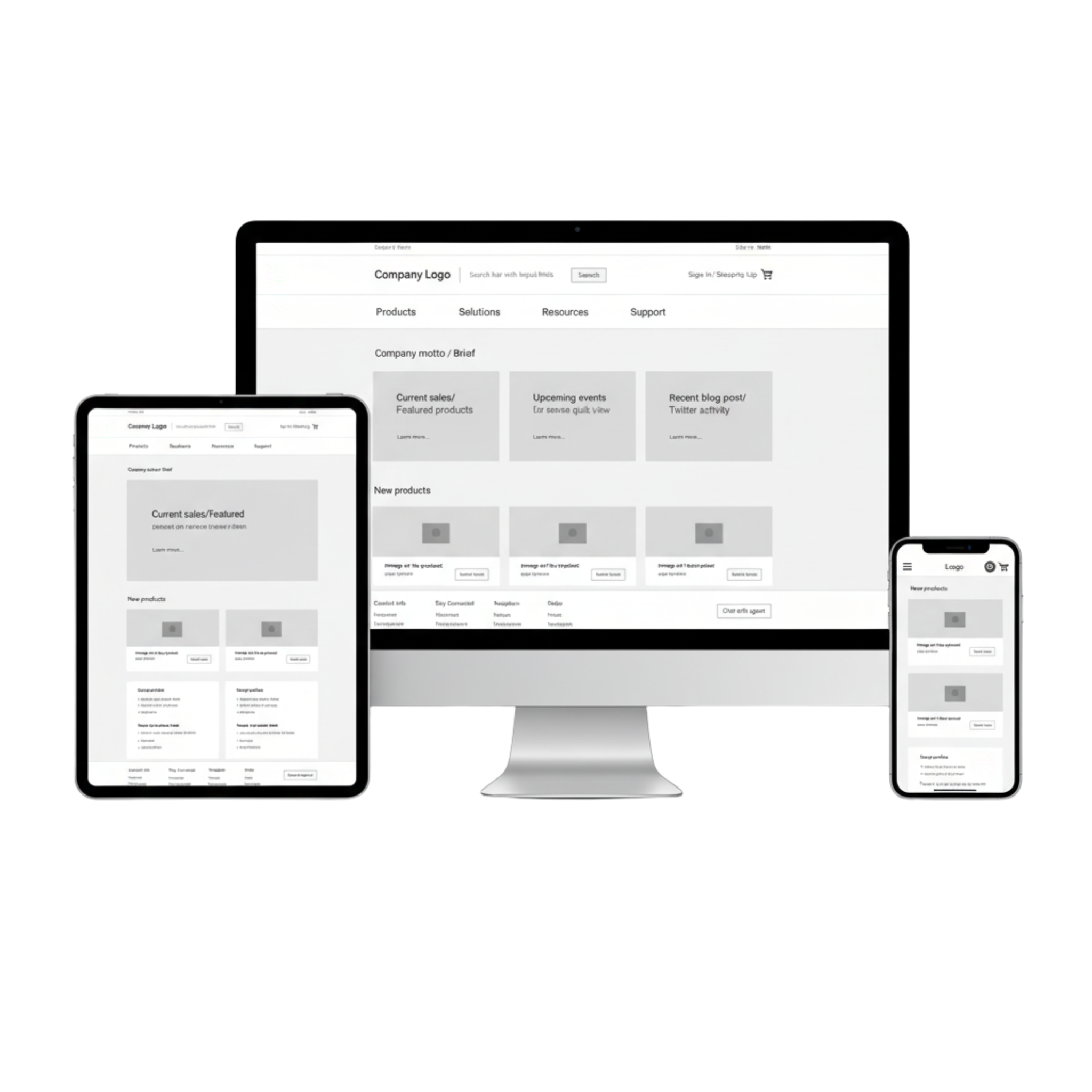
This assignment focused on redesigning the homepage of a B2B e-commerce website across desktop, tablet, and mobile breakpoints. The goal was to create responsive wireframes and increase usability, accessibility and conversion
Role - UX/UI Designer
Duration - 2 weeks
Tools - Figma, Pencil Sketching, Annotations
Problem & Challenge
Analytics showed a high bounce rate: users landed on the homepage but left quickly. Feedback cited clutter, confusing navigation, and difficulty finding products. Returning customers wanted faster access to frequently ordered items
The challenge was to restructure the homepage so that it was organized, accessible, and consistent across desktop, tablet, and mobile devices.
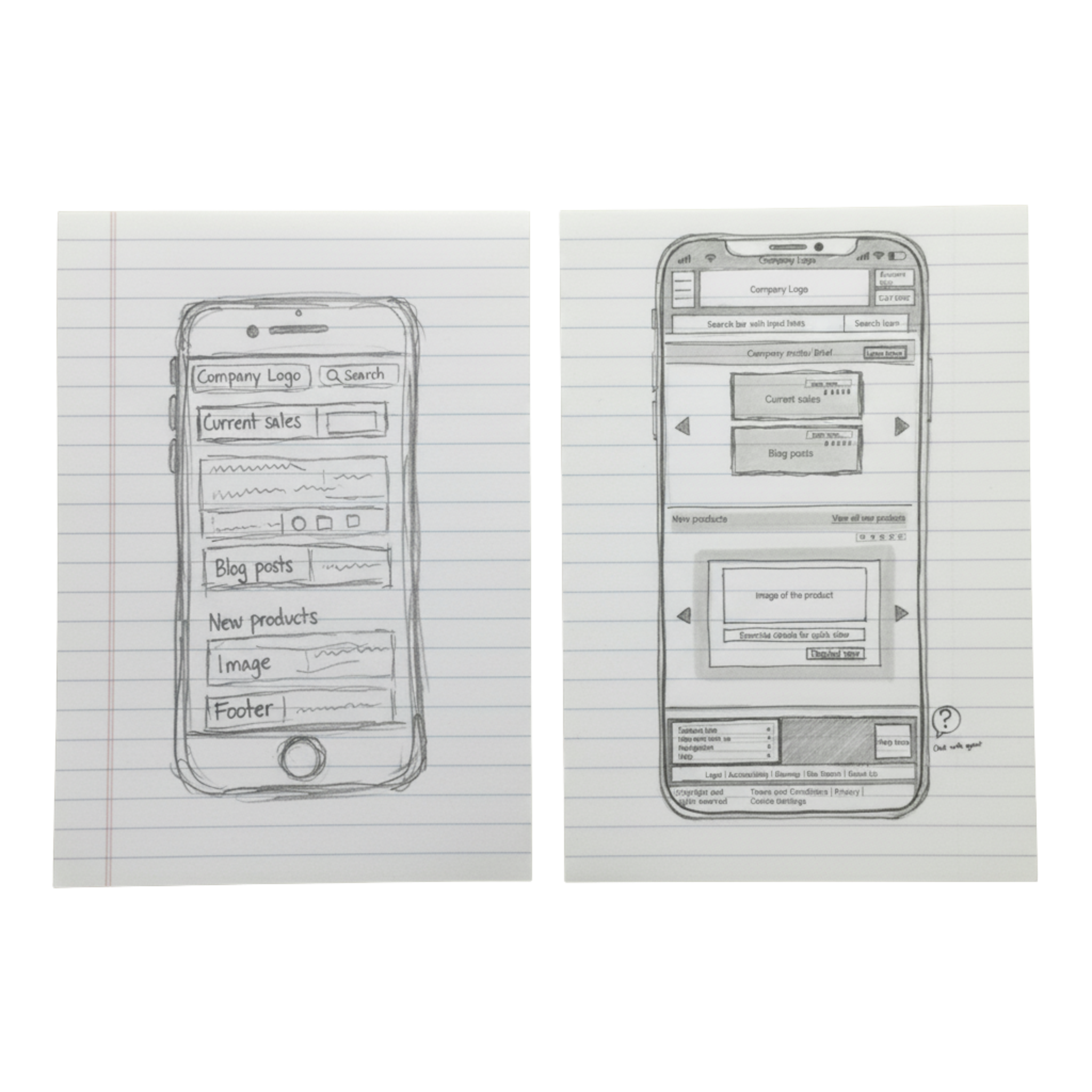
Sketches & Ideation
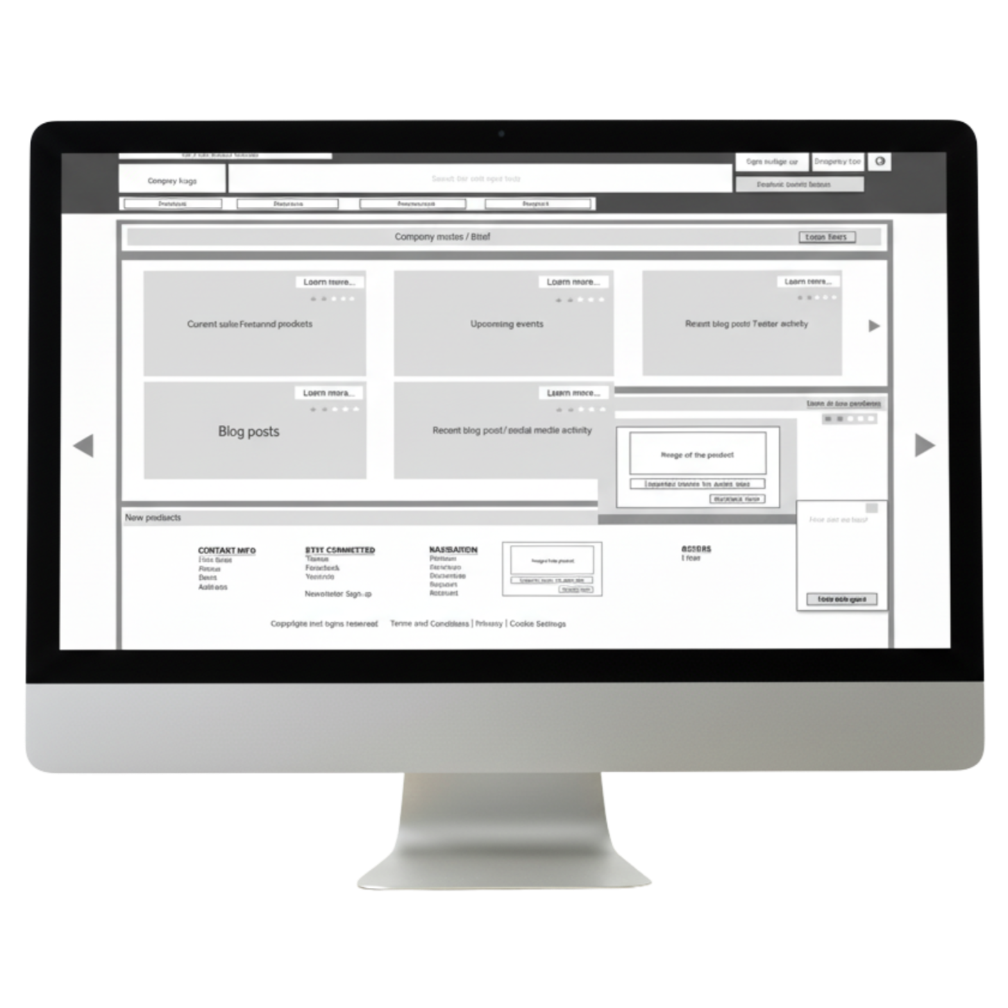
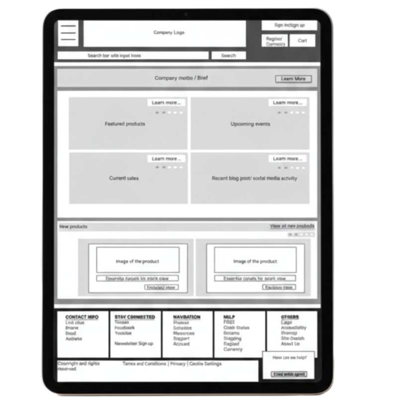
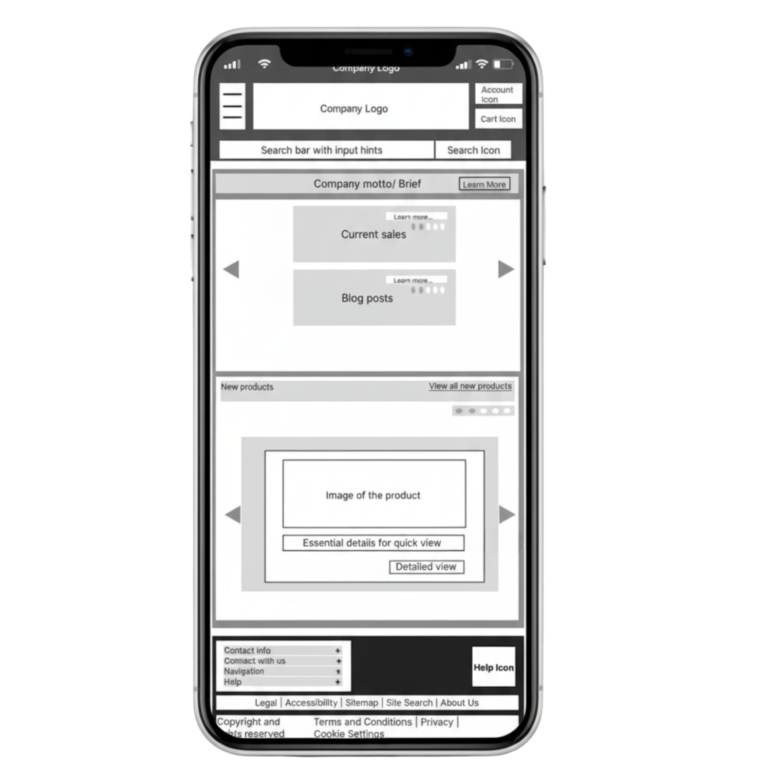
Initial sketches mapped out the required elements: header (logo, navigation, search, cart), featured products, company intro, resource/blog content, and footer
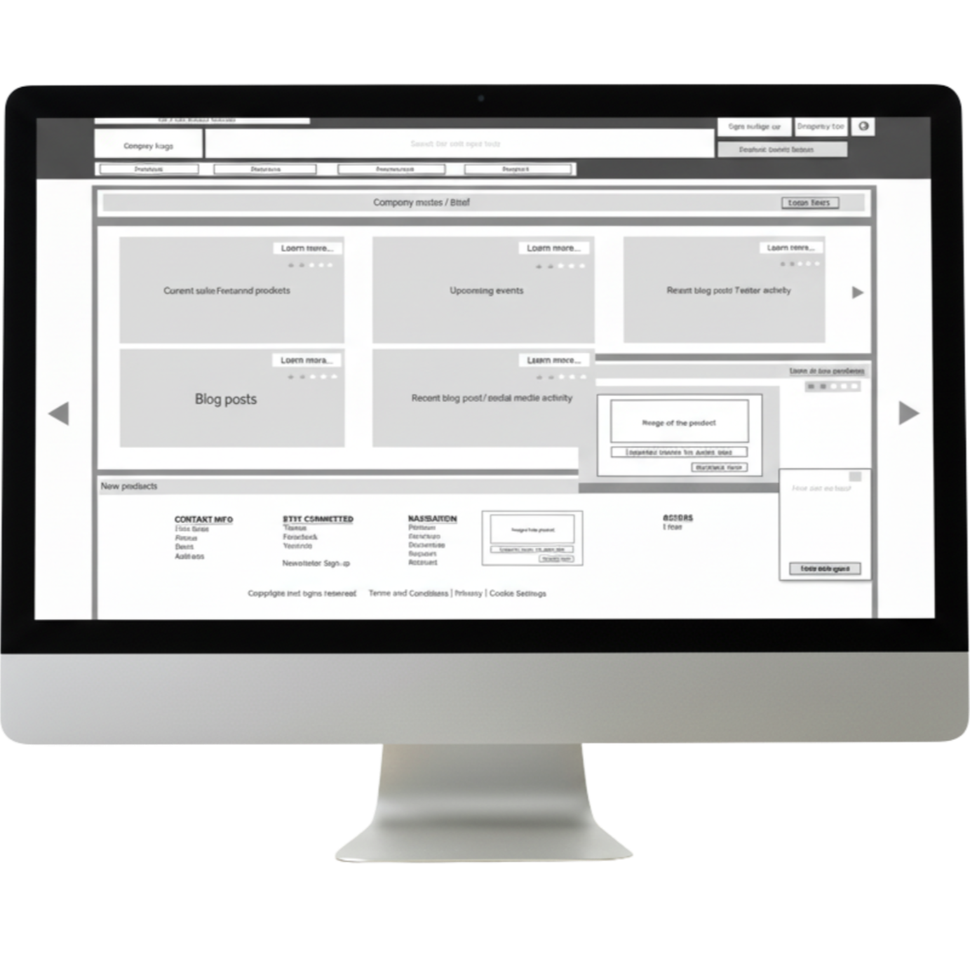
Wireframing & Feedback
Wireframes were built in grayscale to emphasize structure. Peer critique focused on keeping navigation consistent across breakpoints, maintaining hierarchy, and simplifying the featured area.
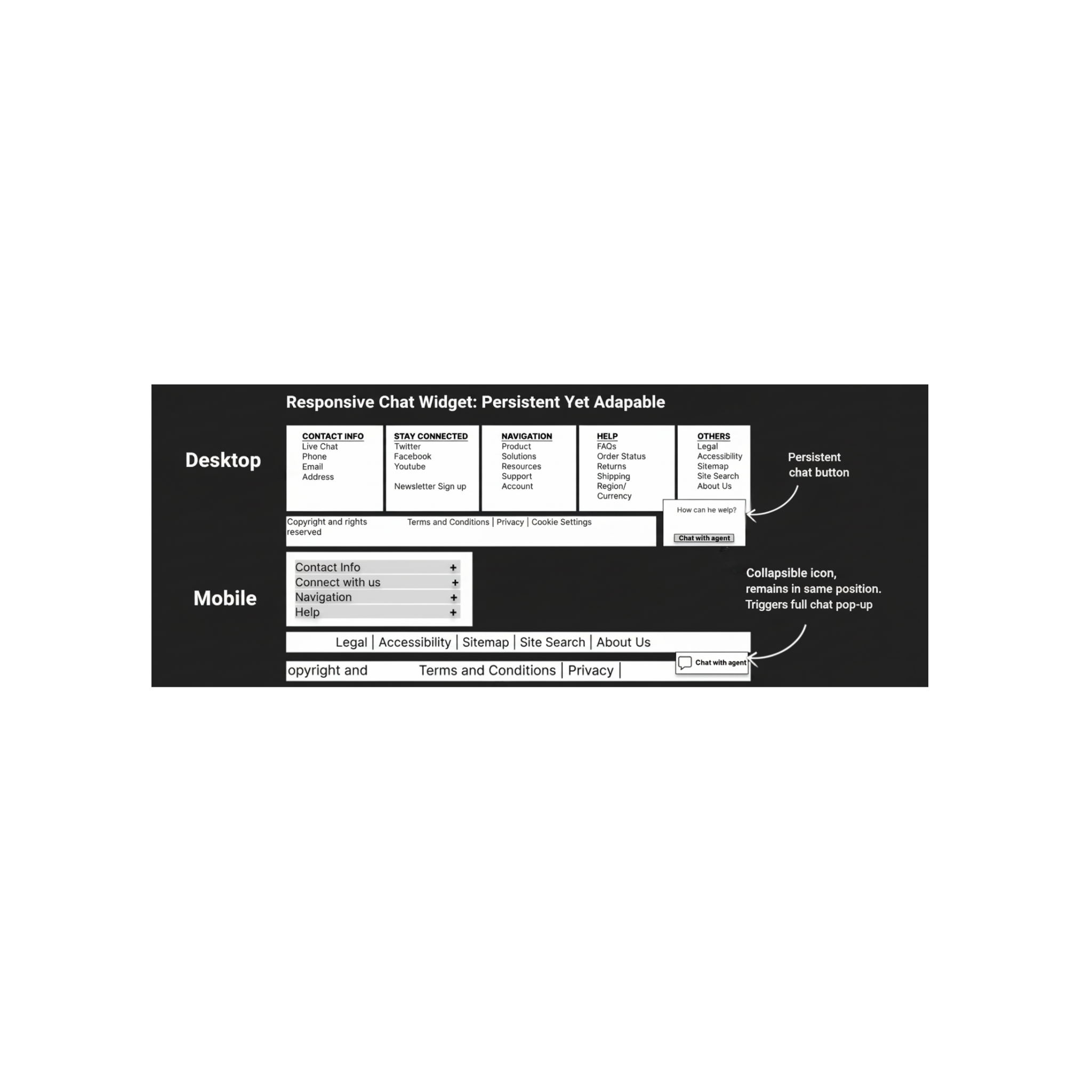
Annotations and Decisions
Each wireframe included explanations of how elements adapted across breakpoints - e.g., search bar remains prominent in header, featured content condenses into a vertical card list on mobile, and footer reorganizes into expandable sections.
Key Deliverables
“Responsive web design is about creating a seamless user experience regardless of device.”
— Ethan Marcotte, Responsive Web Design (2011)